
Data Visualization
Seaborn plots
Data Visualization Using Seaborn
Seaborn is used for data visualization, and it is based on matplotlib. It provides a high-level interface for drawing attractive and informative statistical graphics.
Data visualization is used for finding extremely meaningful insights from the data. It is used to visualize the distribution of data, the relationship between two variables. When data are visualized properly, the human visual system can see trends and patterns that indicate a relationship.
Let’s learn about different types of seaborn plots in this article.
Table of contents
- Visualizing the distribution of the dataset
- Histogram
- Kdeplot
- distplot
- jointplot
- pairplot
2. Visualizing associations among two or more quantitative variables
- scatterplot
- lineplot
- lmplot
- pointplot
3. Plotting categorical data
- barplot
- countplot
- boxplot
- violinplot
- stripplot
- swarmplot
Dataset
I have taken a small dataset for easy understanding.
Visualizing the distribution of the dataset.
1. Univariate distribution
- histogram
- kdeplot
- distplot
2. Bivariate distribution
- joint plot
- pairplot
Univariate distribution
1. Histogram
A histogram is used for visualizing the distribution of a single variable(univariate distribution). A histogram is a bar plot where the axis representing the data variable is divided into a set of bins, and the count of observations falling under each bin is shown on the other axis.
Data variable vs count
Importing libraries and dataset
import pandas as pd
import numpy as np
import matplotlib.pyplot as plt
%matplotlib inline
import seaborn as sns
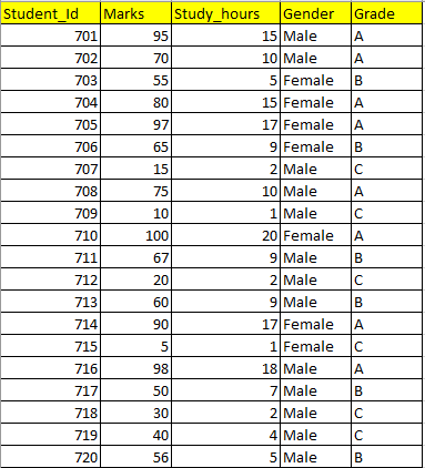
df=pd.read_csv("Results.csv")
df.head(3)
Now we will create histogram plots.
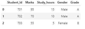
Creating histogram for “Marks” variable. Let’s see the distribution of marks in this dataset.
sns.histplot(x="Marks",data=df)

Inference
- From the plot, we can see the range of marks. (5 to 100)
- This plot also clearly shows that more students get marks of more than 80.
hue
In seaborn, the hue parameter determines which column in the data frame should be used for color encoding.
We can include the “Grade” variable as a hue parameter.
sns.histplot(x="Marks",data=df,bins=10,hue="Grade")
Inference.
Now, after adding the hue parameter, we get more information like which range of marks belongs to which grade.
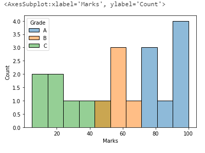
2. KDE plot
A kernel density estimate (KDE) plot is a method for visualizing the distribution of observations in a dataset, similar to a histogram. KDE represents the data using a continuous probability density curve in one or more dimensions.
KDE →Kernel density estimation is the way to determine the probability density function of a continuous variable.
Data variable vs density
sns.kdeplot(x="Marks",data=df)
Inference
By using the KDE plot, we can infer the probability density function of the continuous variable.
hue parameter in KDE plot
sns.kdeplot(x="Marks",data=df,hue="Grade")

3. Distplot
Distplot is a combination of a histogram with a line (density plot) on it. Distplot is also used for visualizing the distribution of a single variable(univariate distribution).
In distplot, the y-axis represents density. So the histogram height shows a density rather than a count. This is implied if a KDE or fitted density is plotted.
sns.distplot(df[“Marks”])

To visualize only a density plot, we can give hist=False.
sns.distplot(df[“Marks”],hist=False)

To visualize only the histogram, we can give kde=False.
sns.distplot(df[“Marks”],kde=False)

Bivariate distribution
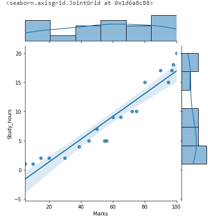
1. jointplot
A Jointplot displays the relationship between two numeric variables. It is a combination of scatterplot and histogram.
sns.jointplot(x=”Marks”,y=”Study_hours”,data=df)

The joint plot also draws a regression line if we mention kind=” reg”.
sns.jointplot(x=”Marks”,y=”Study_hours”,data=df,kind=”reg”)
Using hue as a parameter
sns.jointplot(x=”Marks”,y=”Study_hours”,data=df,hue=”Grade”)

Pairplot
Pairplot is used to describe pairwise relationships in a dataset. Pairplot is used to visualize the univariate distribution of all variables in a dataset along with all of their pairwise relationships. For n variables, it produces n*n grid.
The diagonal plots are histograms and all the other plots are scatter plots.
sns.pairplot(df)
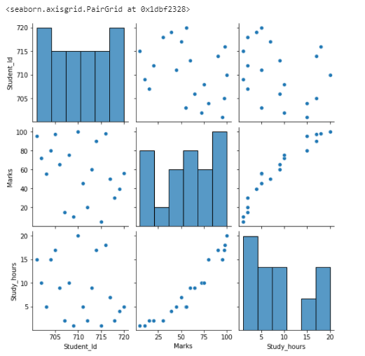
Inference
Data distribution should show some trends. In this example, Marks vs Study_hours gives a linear relationship(positive correlation).
Student_Id column is not showing any relationship with the “Marks” and also the “Study_hours” variable.
Student_Id column can be dropped from the dataset.
Using hue parameter in pairplot.
sns.pairplot(df,hue=”Grade”)

Visualizing associations among two or more quantitative variables
1.KDE plot
KDE plot can be used for bivariate distribution also.
Let’s see the distribution of data for “Study_hours” vs “Marks”
sns.kdeplot(x="Study_hours",y="Marks",data=df)

2. Scatter plot
The scatterplot shows the relationship between two numerical variables.
Inference
From scatterplot, we can determine the correlation between the variables
- Positive Correlation: Relationship between two variables when two variables move in the same direction.
- Negative Correlation: Relationship between two variables when two variables move in a different direction.
- Zero Correlation: No relationship between the two variables.
Example 1: Let’s see the relationship between “Marks” and “Study_hours”
sns.scatterplot(x="Marks",y="Study_hours",data=df)

Inference:
Indicates Positive correlation. Marks increases when Study_hours increases.
Example 2: Let’s see the relationship between “Student_Id” and “Marks”.
sns.scatterplot(x="Marks",y="Student_Id",data=df)
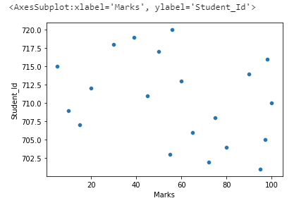
Inference:
We can see that there is zero correlation between “Student_Id” and “Marks”. We can drop the column “Student_Id” from the dataset since it’s not related to the “Marks” variable.
Example 3: Using the hue parameter in a scatterplot.
In a scatterplot, we can add a third variable by mentioning in hue parameter. It will be shown in colors.
sns.scatterplot(x=”Marks”,y=”Study_hours”,data=df,hue=”Grade”)

3. Line plot
The relationship between the two variables can be shown by a line plot.
Example 1: Let’s see the relationship between “Marks” and “Study_hours”
sns.lineplot(x=”Marks”,y=”Study_hours”,data=df)

Inference
“Marks” increases when “Study_hours” increases.
Using the hue parameter in lineplot
sns.lineplot(x=”Marks”,y=”Study_hours”,data=df,hue=”Grade”,style=”Grade”)

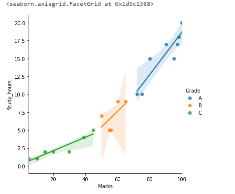
4. lmplot
A lmplot is a scatterplot with a trend line. A lmplot is used to plot the regression line.
sns.lmplot(x=”Marks”,y=”Study_hours”,data=df)

Inference:
Both “Marks” and “Study_hours” variables have a linear relationship. Shade distribution around the regression line indicates the data distribution.
Using hue parameter in lmplot
sns.lmplot(x=”Marks”,y=”Study_hours”,data=df,hue=”Grade”)
5. pointplot
sns.pointplot(x=”Study_hours”,y=”Marks”,data=df)

Inference:
“Marks” increase when “Study_hours” increases. The vertical line shows the range of values(“Marks”) for that particular “Study_hours”.
sns.pointplot(x=”Study_hours”,y=”Marks”,data=df,hue=”Grade”)

Categorical Plots
Visualizing Amounts
In many scenarios, we may want to visualize the magnitude of some set of numbers. Like the total number of students in each class or the total number of employees working in different companies.
To visualize amounts, bar plots are used.
1.Bar plot
A bar plot represents an estimate of central tendency for a numeric variable [Mean] with the height of each rectangle and provides some indication of the uncertainty around that estimate using error bars.
Barplot will only show the mean value of a numerical variable for each level of the categorical variable.
If we want the distribution of values at each level of the categorical variable, we can use a boxplot or violin plot.
Example 1: Let’s do a barplot between “Grade” and “Marks” [Categorical vs numeric variable)
sns.barplot(x=”Grade”,y=”Marks”,data=df)

Inference:
For each grade level, the mean value of “Marks” is shown.
Let’s calculate the mean value of Marks in grade A.
In grade level A, “Marks” are 95,72,80,97,75,100,90,98.
Mean = (95+72+80+97+75+100+90+98)/7 =707/8Mean=88.375
Error bar is shown from 72 to 100 (Since “Marks” range from 72 to 100 in Grade A)
Countplot
Countplot shows the count of observations in each categorical bin using bars.
sns.countplot(x=”Grade”,data=df)

Inference:
We come to know the count of students who got A grade, B grade, and C grade.
Adding hue parameter in countplot
sns.countplot(x=”Grade”,data=df,hue=”Gender”)

Inference:
We come to know the count of male and female students in each grade.
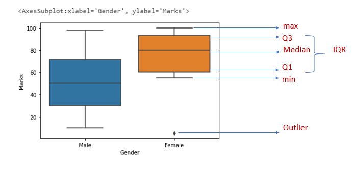
Boxplot
Boxplot is used to describe how the data is distributed in the dataset. This graph represents five-point summary(minimum, maximum, median, lower quartile, and upper quartile). This graph is used to identify outliers.
- whiskers — denote the spread of data
- The length of the upper whisker is the largest value that is no greater than the
third quartile(Q3)plus 1.5 times theinterquartile range(IQR) - The data points above the upper whisker and lower whisker are detected as outliers.
- box — represents the IQR- 50% of data lies within this range
sns.boxplot(x=”Gender”,y=”Marks”,data=df)
ViolinPlot
Violinplot helps to see both the distribution of data in terms of kernel density estimate and box plot.
sns.violinplot(x=”Grade”,y=”Marks”,data=df)

Inference
The white dot in the middle is the median value and the thick black bar in the center represents the interquartile range. The thin black line extended from it represents the max and min values in the data.
The density plot is rotated and kept on each side to show the distribution of data.
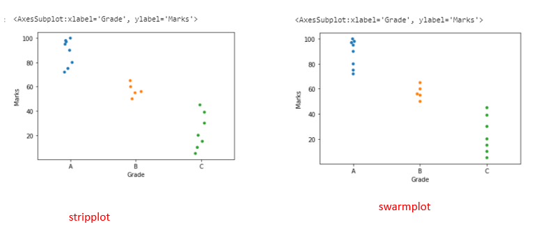
Stripplot
A Stripplot is a one-dimensional scatterplot of the given data where one variable is categorical. This is usually used when the sample size is small.
sns.stripplot(x=”Grade”,y=”Marks”,data=df)
Swarmplot
Swarmplot is similar to stripplot but the points are adjusted along with the categorical data so that they do not overlap. Swarmplot will describe the data better than stripplot.
sns.swarmplot(x=”Grade”,y=”Marks”,data=df)
Heatmap
Heatmap is a two-dimensional graphical representation of data where individual values that are contained in a matrix are represented using colors.
Let’s see how to check correlation using a heatmap.
Correlation is a statistical technique that is used to check how two variables are related.
sns.heatmap(df.corr(),annot=True,vmin=-1,vmax=1)
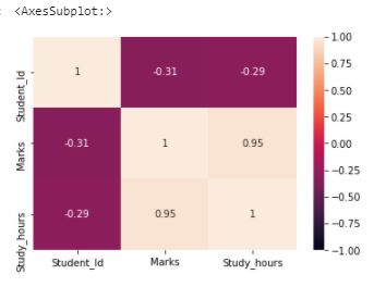
Inference:
If the correlation is 1 or near to 1, two variables are strongly correlated. In this dataset, “Marks” and “Study_hours” have a strong correlation.
Key Takeaways

- Stripplot and Swarmplot are categorical scatterplots
- Box plot and violin plot are categorical distribution plots
- Barplot and Countplot are categorical estimate plots.
- Histogram, kdeplot, distplot are univariate distribution plots
- jointplot is a bivariate distribution plot.
Hue Parameter
The relationship between x and y can be shown for different subsets of the data using the hue, size, and style parameters.
If the hue parameter is given as numeric variables means they are represented with a sequential colormap by default.
If the hue parameter is given as a categorical variable means they are represented in different colors.
This covers some of the data visualizations using seaborn.
I hope that you have found this article helpful. Thanks for reading!
Make a one-time donation
Make a monthly donation
Make a yearly donation
Choose an amount
Or enter a custom amount
Your contribution is appreciated.
Your contribution is appreciated.
Your contribution is appreciated.
