
Descriptive Statistics in Python
Descriptive statistics include those that summarize the central tendency, dispersion, and shape of a dataset’s distribution.
- Measure of central tendency
- Measure of spread/dispersion
- Measure of symmetry [ will save this for the future post]
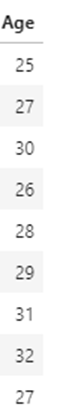
Dataset
Imported all the libraries needed for statistical plots and created a dataframe from the dataset given in bmi.csv file.
This dataset contains Height, Weight, Age, BMI, and Gender columns. Let’s calculate descriptive statistics for this dataset.
The code used in this project is available as a Jupyter Notebook on GitHub.
import numpy as np
import pandas as pd
import matplotlib.pyplot as plt
% matplotlib inline
df=pd.read_csv("bmi.csv")
df

Measure of Central Tendency
Measure of central tendency is used to describe the middle/center value of the data.
Mean, Median, Mode are measures of central tendency.
1. Mean
- Mean is the
average valueof the dataset. - Mean is calculated by adding all values in the dataset divided by the number of values in the dataset.
- We can calculate the mean for only numerical variables
Formula to calculate mean

- Calculating the mean of the “Age” column in our dataset.
- Mathematical Calculation

- Calculating Mean for a particular variable (“Age”) using Python.
df["Age"].mean()
Output: 28.333333333333332
- Calculating the mean for all the columns in the dataframe.
df.mean()

Calculated mean only for numerical datatype. “Gender” column in the dataset is excluded.
2. Median
- The Median is the
middle numberin the dataset. - Median is the best measure when we have outliers.
Find the median of the “Age” column in our dataset.
Mathematical Calculation

If we have an even number of data, find the average of the middle two items.
Example:
Age → 4,12,24,8,16,20
Sort → 4,8,12,16,20,24
Pick the middles ones → 12,16
Find the average → 28/2 =14
Calculating the median for a particular variable (“Age”) using Python.
df["Age"].median()
Output: 28
Calculating the median for all the columns in the dataframe.
df.median()

Calculated median only for the numerical datatype. The “Gender” column in the dataset is excluded.
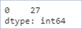
3. Mode
The mode is used to find the common number in the dataset.
Calculating mode for a particular variable (“Age”) using a mathematical calculation

Calculating the mode for a particular variable (“Age”) using Python.
df["Age"].mode()
Calculating the mode for all the columns in the dataframe.
df.mode()
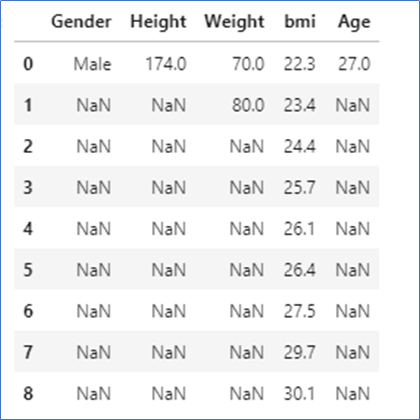
Here, in bmi column, all numbers are unique. So, all numbers are displayed.
Weight column,70.0, and 80.0 are repeated more times, so both are displayed.
Measure of spread
- The measure of spread/dispersion is used to describe how data is spread. It also describes the variability of the dataset.
- Standard Deviation, Variance, Range, IQR, are used to describe the measure of spread/dispersion
- The measure of spread can be shown in graphs like boxplot.
1.Variance
Variance is used to describe how far each number in the dataset is from the mean.
Formula to calculate population variance

σ2 — Population Variance
μ -Population Mean
N -Total number of data in the dataset.
Calculating variance for “Age” column in the dataset
df["Age"].var()
Output: 5.5
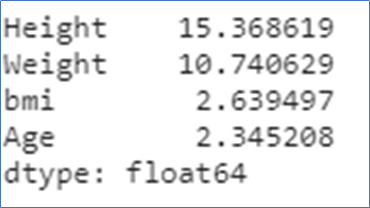
Calculating variance for all columns in the dataframe
df.var()

Calculated variance only for numeric data types. The “Gender” column is excluded.
2.Standard Deviation
- Standard Deviation is the measure of the spread of data from the mean.
- Standard deviation is the square root of variance.
- More the standard deviation, more the spread.
Calculating the standard deviation for “Age” column in the dataset
df["Age"].std()
Output: 2.345207879911715
Calculating the standard deviation for all columns in the dataset.
df.std()
3.Range
- The range is the difference between the largest number and the smallest number
- Larger the range, the more the dispersion.
Calculating the range of “Age” column in the dataset
m1=df["Age"].max()
m1
#Output:32
m2=df["Age"].min()
m2
#Output:25
range=m1-m2
range
#Output: 7
4. Interquartile range (IQR)
- Quartiles describe the spread of data by breaking into quarters. The median exactly divides the data into two parts.
- Q1(Lower quartile) is the middle value in the first half of the sorted dataset.
- Q2– is the median value
- Q3 (Upper quartile) is the middle value in the second half of the sorted dataset
- The interquartile range is the difference between the 75th percentile(Q3) and the 25th percentile(Q1).
- 50% of data fall within this range.
Calculating IQR for “Age” column in the dataset.
Q1=df["Age"].quantile(0.25)
Q1
#Output : 27.0
Q3=df["Age"].quantile(0.75)
Q3
#Output: 30.0
IQR=Q3-Q1
IQR
#Output: 3.0
describe()
describe() function generates descriptive statistics.It is used to view some basic statistical details like mean, median, min, max, percentiles, count of a dataframe, or series of numeric values.
- Series
df["Age"].describe()

2. Dataframe
df.describe()
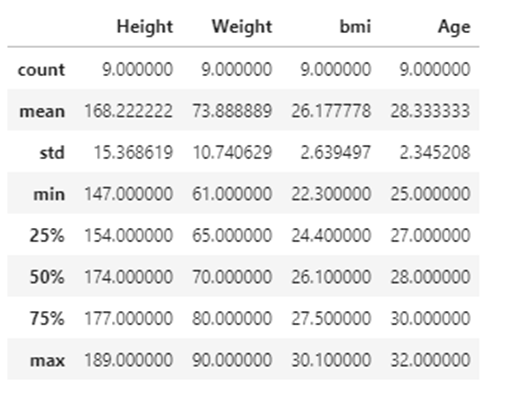
25% → Q1-Lower quartile
50% → Median
75% → Q3-Upper quartile
3. include=”all”
All columns of the input will be included in the output.
df.describe(include="all")

Five-point summary
The five-point summary consists of five values
- Minimum value
- Q1 -Lower quartile
- Median
- Q3-Upper quartile
- Maximum value
Statistical Plots
Statistical plots are used to identify outliers, visualize distributions, discover relationships, and the correlation between variables in a dataset.
Boxplots
Boxplot is used to describe how the data is distributed in the dataset. This graph represents five-point summary(minimum, maximum, median, lower quartile, and upper quartile). This graph is used to identify outliers.
- whiskers — denote the spread of data
- box — represents the IQR- 50% of data lies within this range
df.boxplot(column="Age")
Output:

Explaining the boxplot
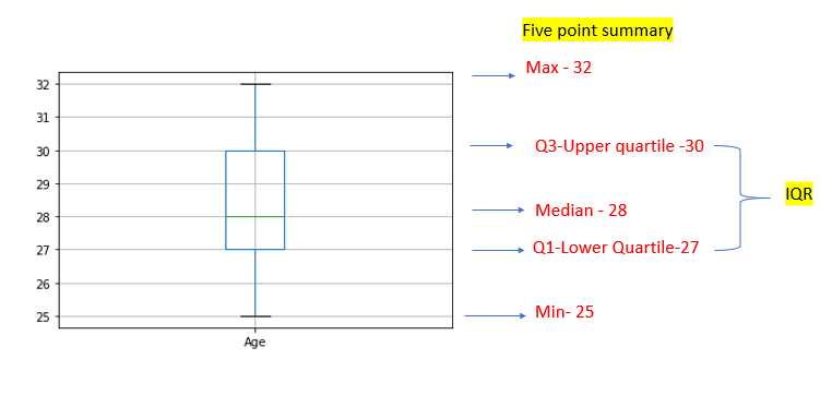
In the “Age” category, no outliers are there.
Boxplot grouped by gender category
df.boxplot(column="Age",by="Gender")

Here we have an outlier in the “Male” category.
Let’s calculate a five-point summary for “Age” under “Male” category
Calculating Mean of “Age” of Male alone.
df1=df.set_index("Gender")
df2=df1.loc["Male","Age"]
df2.mean()
#Output: 28.0
Calculating Q1, Q3, and IQR
q1=df2.quantile(0.25)
print ("Q1 :",q1)
q3=df2.quantile(0.75)
print ("Q3 :",q3)
IQR=q3-q1
print ("IQR :",IQR
Output:
Q1 : 27.0
Q3 : 28.75
IQR : 1.75
Calculate the length of the upper whisker
The length of the upper whisker is the largest value that is no greater than the third quartile(Q3) plus 1.5 times the interquartile range(IQR)
whisker=(IQR*1.5)+Q3
print("Length of Upper Whisker :",whisker)
#Output:Length of Upper Whisker : 31.375
The length of the upper whisker should not be greater than 31.375
Age of Male → 25,27,28,29,32,27
32 falls above the upper whisker range. So, it’s an outlier.
So the length of the upper whisker is taken as 29(second maximum) which falls under the upper whisker range.

Boxplot using seaborn
sns.boxplot(x="Age",data=df)

Boxplot grouped by gender category
sns.boxplot(x="Age",y="Gender",data=df)

Visualizing distributions of data
Plotting univariate distributions
Histogram
- This plot will show the distribution of univariate(single variable).
- A histogram is a bar plot where the axis representing the data variable is divided into a set of discrete bins and the count of observations falling within each bin is shown using the height of the corresponding bar.
- Histogram → plotting variable vs their count/frequencies in each bin.
Different ways to plot a histogram
- Using pandas
Histogram for all columns in the dataframe
df.hist()

Histogram for a particular column “Age”
df["Age"].hist()
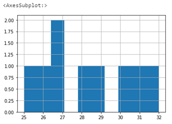
In the above graph, only age 27 appears twice, so the count of age 27 is shown as 2. Remaining all ages appear once only. So all other age count is shown as 1.
Choosing the bin size
df["Age"].hist(bins=20)

2. Using matplotlib
plt.hist(df["Age"])

Plotting Multivariate distribution
Pairplot or Scatterplot
Pairplot is used to describe pairwise relationships in a dataset. Pairplot is used to visualize the univariate distribution of all variables in a dataset along with all of their pairwise relationships.
The diagonal plots are histograms and all the other plots are scatter plots.
sns.pairplot(df)

Resources
seaborn — distributions
pandas.Series.hist
panda.DataFrame.hist
matplotlib-hist
describe()
Make a one-time donation
Make a monthly donation
Make a yearly donation
Choose an amount
Or enter a custom amount
Your contribution is appreciated.
Your contribution is appreciated.
Your contribution is appreciated.
