Dual-axis vs Combined Axis| Blended Axis | Shared Axis

In Tableau, there is something interesting like dual-axis and combined axis. I like to explain in detail about dual-axis and combined axis in this article.
Let’s get started.
Dual Axis
- Dual Axis contains two axis
- Two measures are required.
- One mark card for each axis is created.
How to create a dual-axis graph?
Dual Axis can be created in two ways
Method 1: Drag two measures on the row shelf and in the second measure click the dropdown and tick the dual axis.
Method 2: Drag one measure to the row shelf and after the graph is created, drag the second measure to the other side of the axis and place it.
Let’s look into three types of dual-axis graph
- Dual Axis- Different measure — same scale
- Dual Axis -Different measure — different scale
- Dual Axis-Same measure
1: Dual Axis-Different measures — Same scale
Let’s look at Sales and Profit for each Region.
- Two measures — Sales and Profit.
- Drag Region in Column shelf and Sales in Row shelf.Drag Profit to another side of the axis.
- One marks card is created for each measure.
- Now we can choose, different charts for each measure from the marks card.

- Now we can synchronize axis , since both profit and Sales have the same units(same scale). Click the Axis and choose “Synchronize Axis”

- One marks card is created for each measure. Choose bar chart → Sales and Profit → Circle.
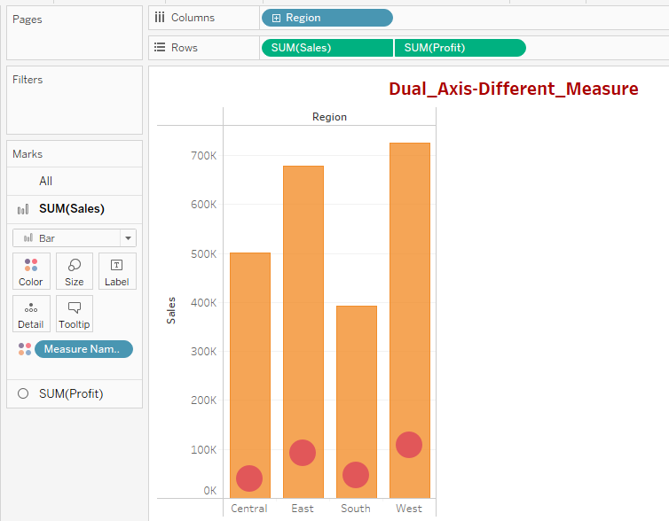
Dual Axis graph — Synchronize Axis

From the above dual-axis graph, we can see the Profit and Sales for each Region.
2: Dual Axis — Different measures — Different scale
If we want to check Profit vs Discount for each Region, no need to synchronize the axis. Since both scales are different.
Follow the same steps in example 1. But drag measures Profit and Discount
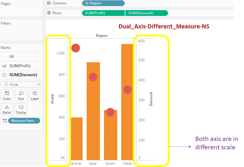
Dual Axis- Different scale

3: Dual Axis — Same measures
We can create a chart with the same measure on a dual-axis.
- Repeat the same step but drag the same measure two times in a row shelf.
- For one measure choose- bar and for the other choose -circle.

Dual Axis-Same Measure — [Bar and Circle]

Dual Axis -Same Measure -[Line and Circle]
Sales in different sub_Categories → In the below graph, I have chosen line and circle for the same measure [Sales].

Combined_Axis
- The combined Axis graph contains only one axis. Also known as Shared Axis.
- We can include more than two measures in the combined axis graph.
- Only one mark card is created.
How to create a combined-axis graph?
First drag one measure into row shelf and one dimension in column shelf.
After that, drag another measure to the same axis and place it. [For dual-axis, we will place in other side of the axis]
In the combined axis, we can drag more than two measures also.
Example 1: Two measures
Let’s compare Sales and Profit over Region.
- Drag Region to column shelf and Sales to row shelf.
- Now drag Profit to the same side of the axis and place it.

Example 2: More than two measures
Let’s compare Sales, Profit, Quantity over Region.
- Drag Region to column shelf and Sales to row shelf.
- Now drag Profit to the same side of the axis and place it.
- Now drag Quantity to the same side of the axis and place it.

Example 3: Stacked Bar Chart
Let’s compare Sales, Profit over Subcategory.
- Drag subcategory to column shelf and Sales to row shelf.
- Now drag Profit to the same side of the axis and place it.
- Now measure names pill will be added in column shelf. Drag that and place in color marks card.

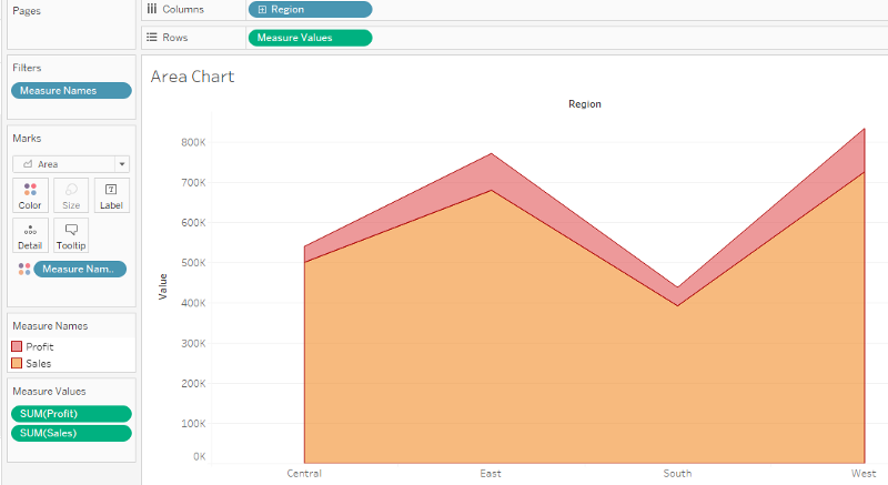
Example 4: Area Chart
Let’s compare Sales, Profit over Region.
- Drag subcategory to column shelf and Sales to row shelf.
- Now drag Profit to the same side of the axis and place it.
- Now measure names pill will be added in column shelf. Drag that and place in color marks card.
- Now change the chart type to Area in marks card.
Example 5: Line Chart
Let’s compare Sales, Profit, and Discount over subcategory.
- Drag subcategory to column shelf and Sales to row shelf.
- Now drag Profit to the same side of the axis and place it.
- Now drag Discount to the same side of the axis and place it.
- Now measure names pill will be added in column shelf. Drag that and place in color marks card.
- Now change the chart type to Line in marks card.
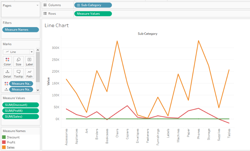
Tableau Public Link — The tableau workbook can be downloaded from my tableau public link.
Conclusion
In this article, I have covered different ways to create dual-axis and combined axis charts in tableau.
I hope you all like it and thanks for reading!
If you like to read more of my tutorials on Python and Data Science,
follow me on Medium, Twitter
