Mastering Scatterplot Customization in R with ggplot

Scatterplots are powerful tools for visualizing the relationship between two continuous variables. They allow us to observe patterns, trends, and outliers in our data. While the default scatterplot settings in R’s ggplot package are useful, customizing the plot can elevate its impact and make it more visually appealing.
In this blog post, we will look how to do scatterplot customization using ggplot in R. We will look at how to adjust the point size, change colors, or add labels, set axis range and tick labels, set the title and axis labels.
So, let’s dive into the world of scatterplot customization and unlock the full potential of your data visualizations in R.
Topics Covered:
- How to plot scatter plot with ggplot2
- How to set the axis range
- How to set the axis ticks
- How to set the axis labels
- How to increase the size of point
- How to set the title and align it
- How to change the background color
- How to draw vertical line and horizontal line
- How to customize plot title, plot axis label, axis text and axes line
- How to remove the legend or change the position of legend
Quick Setup:
We are using the iris dataset for this tutorial. Let’s load the iris dataset first.
Iris Dataset : https://search.r-project.org/CRAN/refmans/fmf/html/iris.html
library(datasets)
data(iris)
summary(iris)
library(ggplot2)
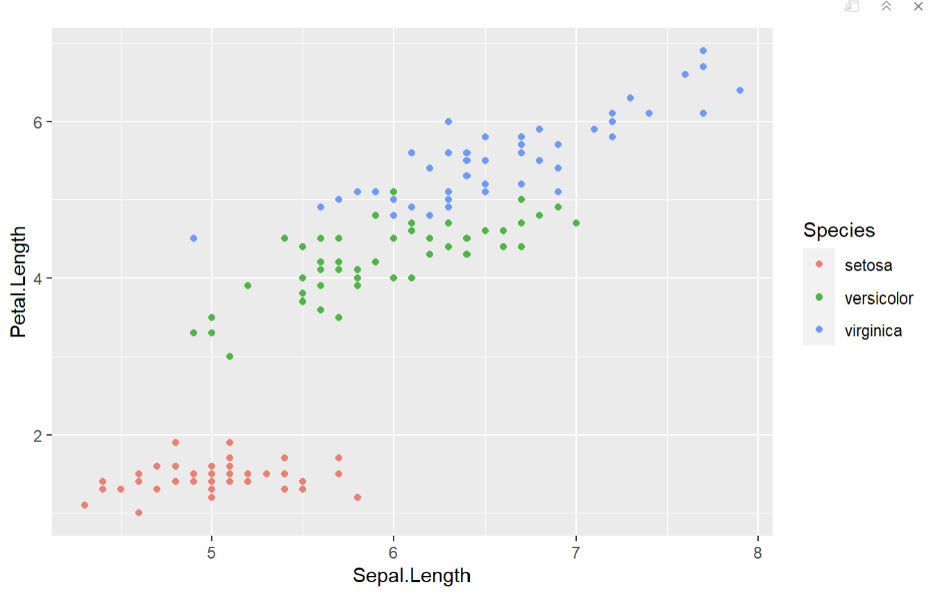
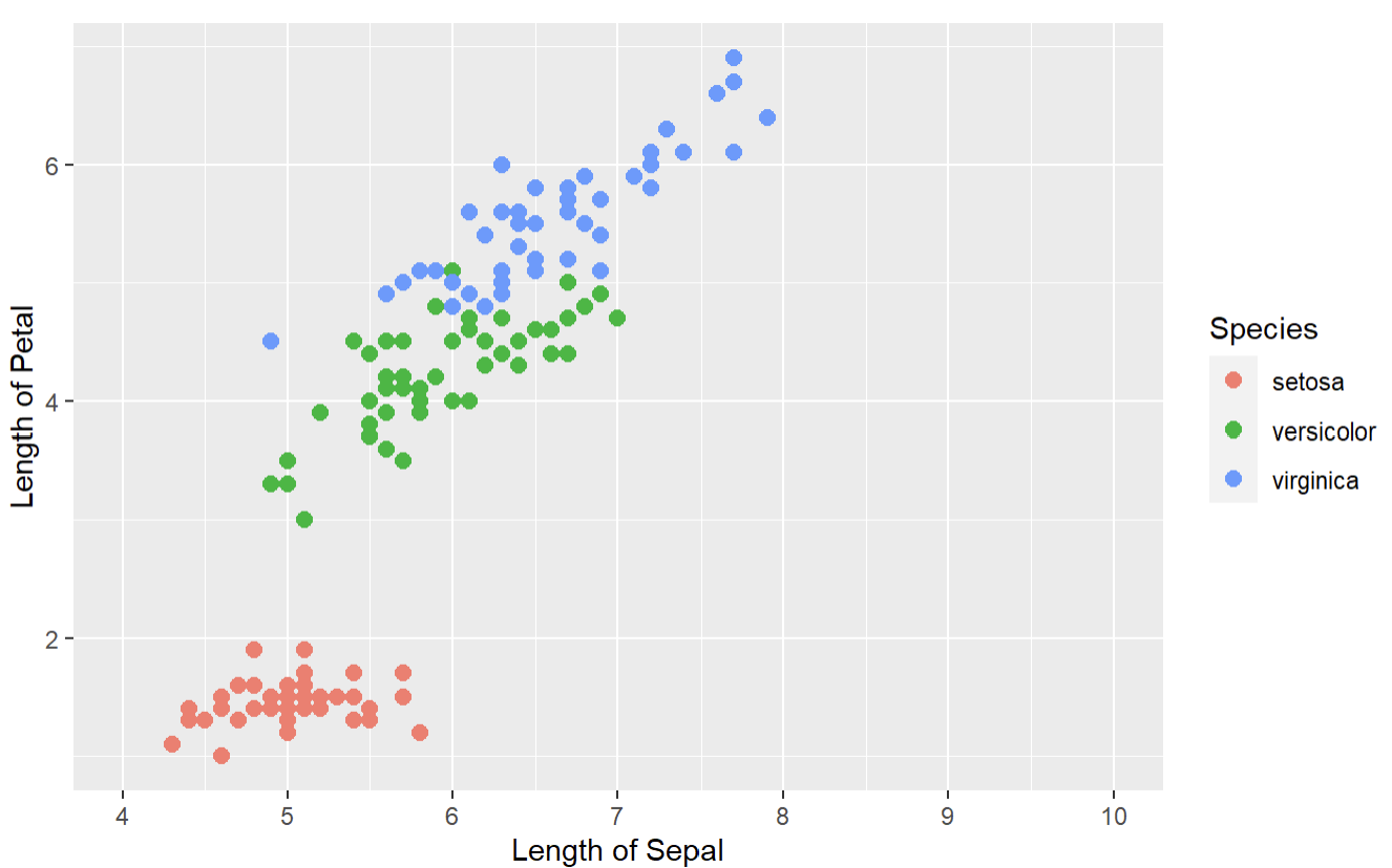
1. How to plot scatter plot with ggplot in R
myplot <- ggplot(iris, aes(x=Sepal.Length, y=Petal.Length, color=Species))+geom_point()
myplot
ggplot(iris, aes(x=Sepal.Length, y=Petal.Length, color=Species))+geom_point()
iris → mention the data first
aes(x=Sepal.Length, y=Petal.Length, color=Species)) → It will create scatterplot of Sepal.Length vs Petal.Lengt and color it by Species.
geom_point() → It will add points to the plot.
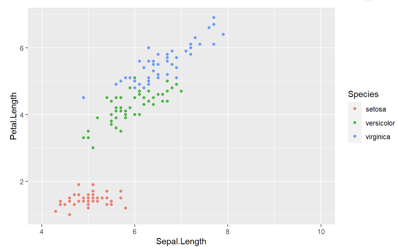
2. How to set the axis range
ggplot(iris, aes(x=Sepal.Length, y=Petal.Length,color=Species))+geom_point()+
scale_x_continuous(limits = c(4,10))
scale_x_continuous(limits = c(4,10) → It will set the x- axis range from 4 to 10.
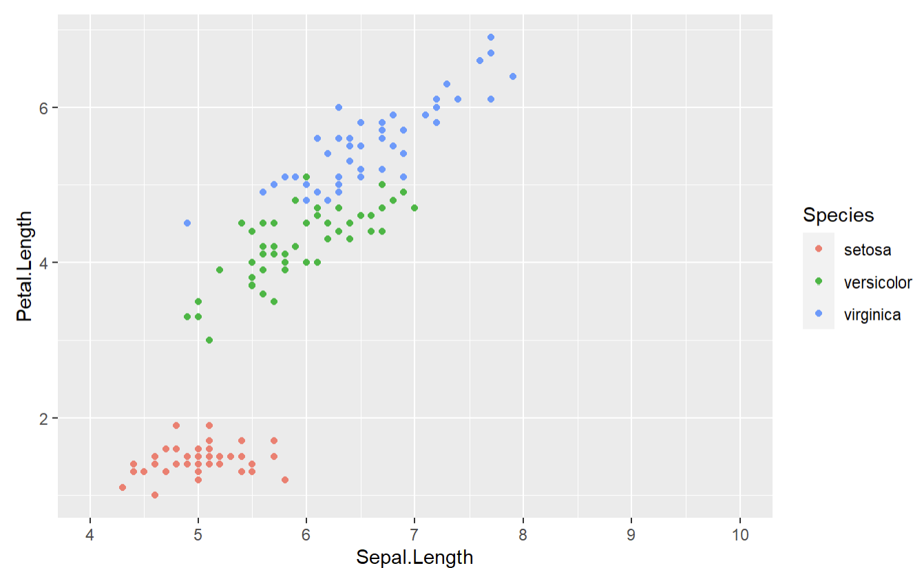
3. How to set the axis ticks
ggplot(iris, aes(x=Sepal.Length, y=Petal.Length,color=Species))+geom_point()+scale_x_continuous(limits=c(4,10),breaks =seq(4,10,1))
scale_x_continuous(limits=c(4,10),breaks =seq(4,10,1))
breaks =seq(4,10,1) → It will set the ticks from 4 to 10 at an interval of 1.
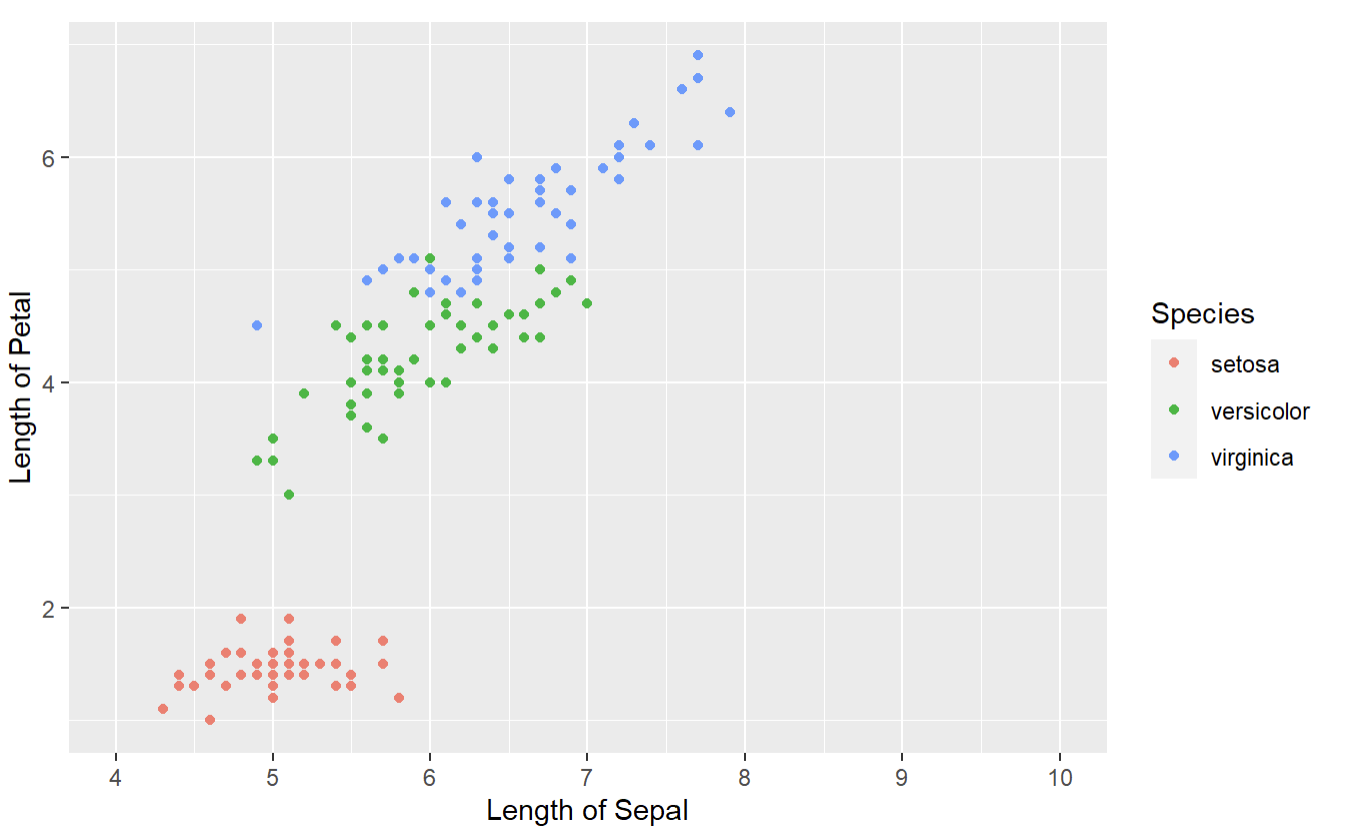
4. How to set the axis labels
ggplot(iris, aes(x=Sepal.Length, y=Petal.Length,color=Species))+geom_point()+
scale_x_continuous(breaks = seq(4,10,1),limits=c(4,10))+labs(x = "Length of Sepal",y="Length of Petal" )
labs(x = “Length of Sepal”,y=”Length of Petal” ) → It will set the label for x axis and y axis.
5. How to increase the size of point
ggplot(iris, aes(x=Sepal.Length, y=Petal.Length,color=Species))+geom_point(size=2.5)+
scale_x_continuous(breaks = seq(4,10,1),limits=c(4,10))+labs(x = "Length of Sepal",y="Length of Petal" )
geom_point(size=2.5) → It will set the point size to 2.5
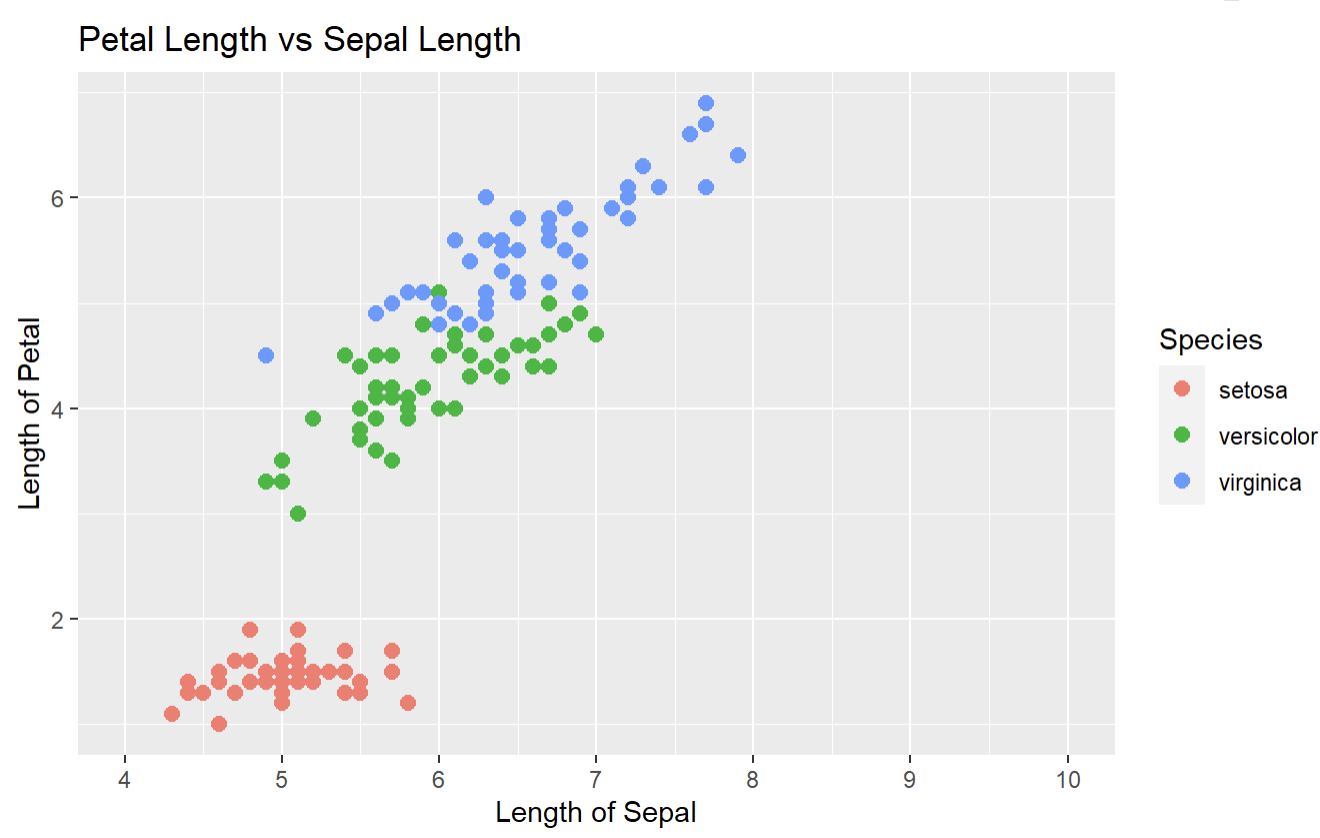
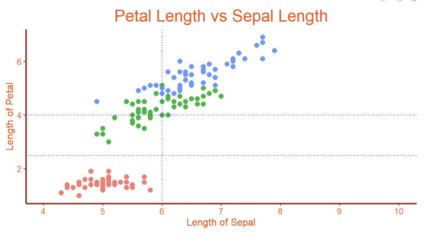
6. How to set the title and align it
myplot <- ggplot(iris, aes(x=Sepal.Length, y=Petal.Length,color=Species))+geom_point(size=2.5)+
scale_x_continuous(breaks = seq(4,10,1),limits=c(4,10))+labs(x = "Length of Sepal",y="Length of Petal" )+ggtitle("Petal Length vs Sepal Length")
myplot
ggtitle(“Petal Length vs Sepal Length”) → It will set the title of the plot.
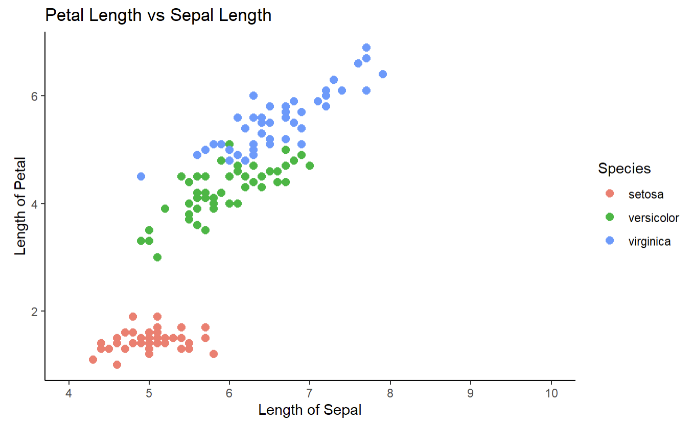
7. How to remove grid lines and change background color
myplot <- myplot + theme_classic()
myplot
theme_classic() → It will set the x axis and y axis ,remove the gridlines and chnage the background to white.
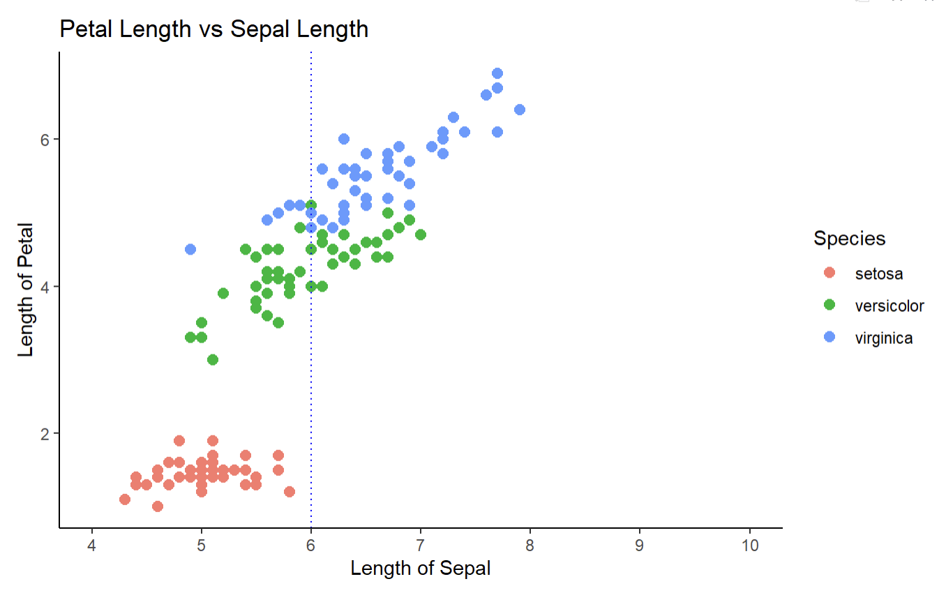
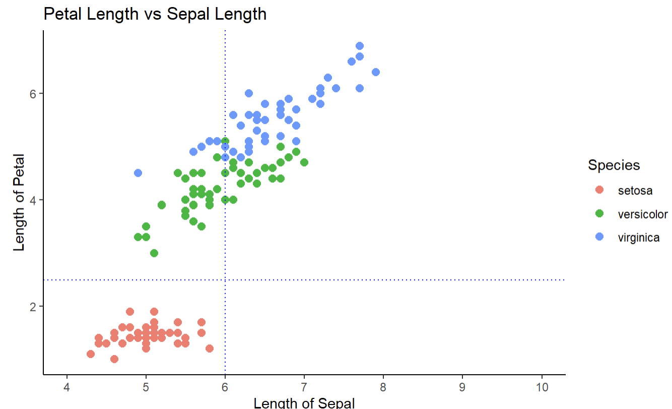
8. How to draw vertical line and horizontal line
Horizontal Line
myplot <- myplot + geom_vline(xintercept = 6.0,linetype="dotted",color='blue')
myplot
geom_vline(xintercept = 6.0,linetype=”dotted”,color=’blue’) → It will draw a horizontal dotted line at x intercept = 6.
Vertical line
myplot <- myplot + geom_hline(yintercept = 2.5,linetype="dotted",color='blue')
myplot
geom_hline(yintercept = 2.5,linetype=”dotted”,color=’blue’) → It will draw a vertical dotted line at y intercept = 2.5
9. How to customize plot title, plot axis label, axis text and axes line?
myplot <- myplot+theme(
plot.title = element_text(size = 20,color='#ff4500',hjust='0.5'),
axis.title = element_text(size = 12,color='#ff4500'),
axis.text = element_text(size = 10,color='#fe5a1d'),
axis.line = element_line(colour='brown', size=1, linetype='solid')
)
myplot
theme(
plot.title = element_text(size = 20,color=’#ff4500′,hjust=’0.5′),
axis.title = element_text(size = 12,color=’#ff4500′),
axis.text = element_text(size = 10,color=’#fe5a1d’),
axis.line = element_line(colour=’brown’, size=1, linetype=’solid’)
)
plot.title = element_text(size = 20,color=’#ff4500′,hjust=’0.5′) → It will change the plot title size, color and shift the title to the centre of the plot.
axis.title = element_text(size = 12,color=’#ff4500′) → It will change the axis title size and color.
axis.text = element_text(size = 10,color=’#fe5a1d’) → It will change the axis tick mark labels size and color.
axis.line = element_line(colour=’brown’, size=1, linetype=’solid’) → It will change the x and y axis color,size and type.
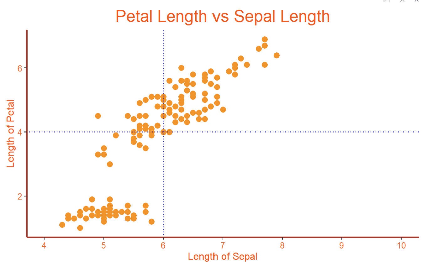
10. How to remove the legend or change the position of legend
myplot <- myplot+theme(
plot.title = element_text(size = 20,color='#ff4500',hjust='0.5'),
axis.title = element_text(size = 12,color='#ff4500'),
axis.text = element_text(size = 10,color='#fe5a1d'),
axis.line = element_line(colour='brown', size=1, linetype='solid'),
legend.position='none')

myplot
legend.position=’none’ → It will remove the legend.
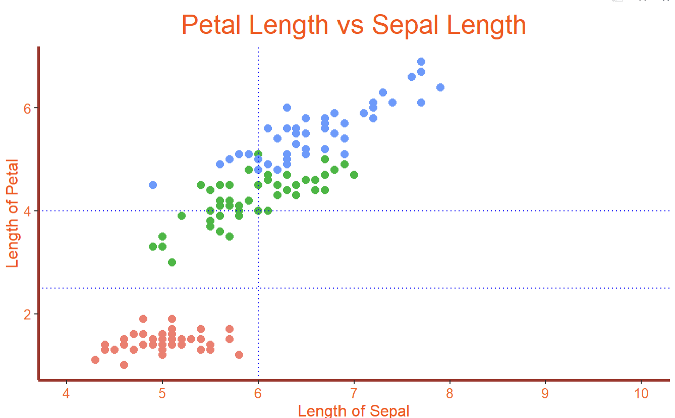
myplot <- myplot+theme(
plot.title = element_text(size = 20,color='#ff4500',hjust='0.5'),
axis.title = element_text(size = 12,color='#ff4500'),
axis.text = element_text(size = 10,color='#fe5a1d'),
axis.line = element_line(colour='brown', size=1, linetype='solid'),
legend.position='bottom'

)

myplot
legend.position=’bottom’ → It will move the legend position to the bottom of the plot.
Conclusion:
In this blog post, we have explored the process of customizing scatterplots using ggplot in R. By learning how to modify various elements such as point size, color, shape, axis labels, and limits, you can create visually captivating and informative scatterplots that effectively convey your data.
Thanks for reading.
